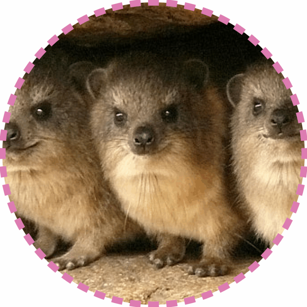
The IRACE logo embodies the vision at the heart of the Association and highlights the importance of multidisciplinarity within the scientific community in the context of the Circular Economy. The name “IRACE” evokes the idea of a race – but not a solitary one. It is a collective race, one that can only be successfully completed through the unification of forces, knowledge, and skills from various disciplines. The small squares in the logo’s design symbolize the finish line – the checkered flag: the common goal. The “irace” is also an animal and is depicted in the graphic of the logo in three different colors, representing distinct disciplinary fields. It is a herd animal, where the strength of the group and the connection among its members are essential for survival in nature. In the same way, multidisciplinarity is key to addressing the challenges of the Circular Economy. Each discipline contributes its own unique expertise, and only by working together can these skills complement and enrich one another, leading to more innovative and effective solutions. The colored eyes of the figures in the logo represent this diversity of perspectives: each color symbolizes a different viewpoint (and a discipline), but all are complementary. And to reach the finish line, they look synergistically in the same direction.
In summary, the logo conveys a fundamental message: in the race toward a sustainable and circular future, success is only possible when the scientific community – represented by experts from all relevant disciplines – runs together.
